Juce 8, new font system

Bold and Italics are simplified concepts. In reality, they are different typefaces.

Take a look here:

Roboto comes in different “weights” (the aforementioned 400, 500, etc.) and styles (Italics).

So what you can do is use e.g. Roboto 400 on Windows and Roboto 300 on Mac, and they will look roughly the same thickness (if you let macOS “smooth” the font). Their heights would be slightly different, as Windows uses different font-metrics than macOS or Linux.

JUCE8 corrects that height difference issue, so if you use the same font, turn the font-smoothing off, then you will get very similar results.

If you don’t like your current font because it’s too thin, you can simply change it from “Regular” (400) to “Medium” (500).

This doesn’t just apply to Roboto but to most modern fonts. There is a new technology emerging, but it’s not widely supported by browsers (and less so my OSes):

So don’t hold your breath. That’s probably for a future version of JUCE, maybe in 5-6 years.

1 Like

Just want to give a +1 to this being looked into. It’s been my personal default (and a no-op on iOS since JUCE 6). Seems like platform parity is pretty valuable, especially after all that hard work put into the new rendering pipeline!

2 Likes

Hi Reuk,

Just wondering, do you consider this centering issue to be an issue to investigate ?

Thanks !

Yes, it’s on my backlog. However, I’ve got some Direct2D issues to investigate first.

1 Like

Can one of the people that worked on FontOptions explain how withName() and withStyle() work?

Since font terminology is so widely misused, I’m not entirely sure we’re all on the same page here. For instance, if I include SF-Pro.ttf (as provided by Apple) in my binary, and load it as a typeface pointer, sf_pro, I would expect the following code to give me the light italic version:

fontOptions = fontOptions.withTypeface(sf_pro).withHeight(10.5f).withStyle("Light Italic");
g.setFont(fontOptions);
g.drawText("What. The.", rect_tmp, Justification::topLeft);

However, it returns the Regular style. SF Pro, which I use here just for example’s sake, has 45 styles (Apple’s terminology) or fonts (literally everyone else that has ever typeset anything), and referenced by name. I would like some clarity in either the docs or here as to what, exactly, you mean by style, name, font, and typeface. JUCE has always been kind of in line with correct terminology here but I sense a bit of a departure.

EDIT: Since it wasn’t obvious in the above ramble, I’ll just note for clarity’s sake that it doesn’t appear that .withStyle() works at all. If I debug, the fontOptions “font” shows that the style is Light Italic, but if I getStyle() on it, that returns “Regular.”

Further to this, I assign my Typeface::Ptr of SF Pro with g.setFont(FontOptions(sf_pro)), then run this bit of code:

auto styles = g.getCurrentFont().getAvailableStyles();
for (const auto& s : styles) DBG(s);

And I am rewarded with a full list of all 45 available styles in SF Pro.

So they are in there and JUCE can see them; I just can’t seem to actually assign them. If I assign a style, and then do getStyle(), it returns the style I assigned, but still shows Regular on screen.

I’ve looked into this a bit now. I suspect that the issue is indeed to do with the particular metrics of the font.

Currently, the drawing position for vertically-centred text is computed by attempting to centre the bounding-box for the text. The bounding box is derived from the ascent and descent of the font. That is, we expect that when drawing text inside a box that is sized exactly to the font’s ascender and descender, it should appear centred within that box.

Of course, this doesn’t work if the font contains bad metrics data.

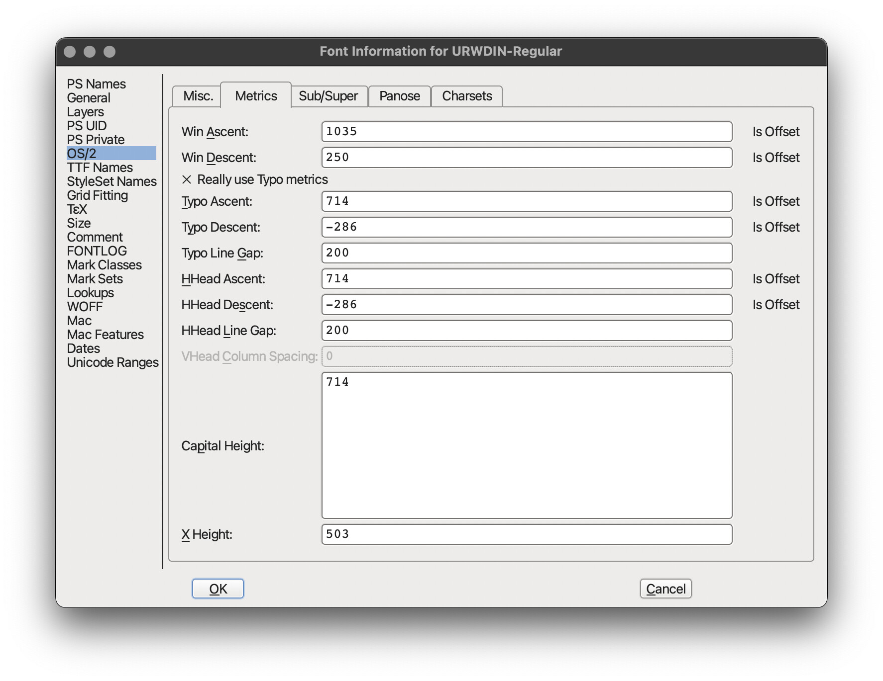
Here are the metrics of the DIN and Acumin font files you linked:


As you can see, in both of these fonts, the Typo and Win descent values are roughly equivalent, but the Typo and Win Ascent values are significantly different.

JUCE’s ‘portable’ metrics kind uses HarfBuzz to fetch the font metrics. As far as I can tell from debugging, HarfBuzz will always return the Typo or HHead metrics values, and never the Win ascent/descent values. So, in the “2KHz label” test case you posted above, we can assume that typo metrics are being used.

If we update the rendering a bit to display the bounding boxes for the glyphs, we can see the problem more clearly. The bounding boxes are correctly centred, but the ascender value is too large relative to the descender value, so the characters appear to hug the top of the bounding box.

The following screenshot shows what happens if we pick the ‘legacy’ metrics kind instead (on Windows - other platforms behave differently). Now, the Win ascent/descent values are used instead of the typo values.

Now, the ratio of ascent:descent means that more space is given over to the ascender, and the text appears to be better centred.

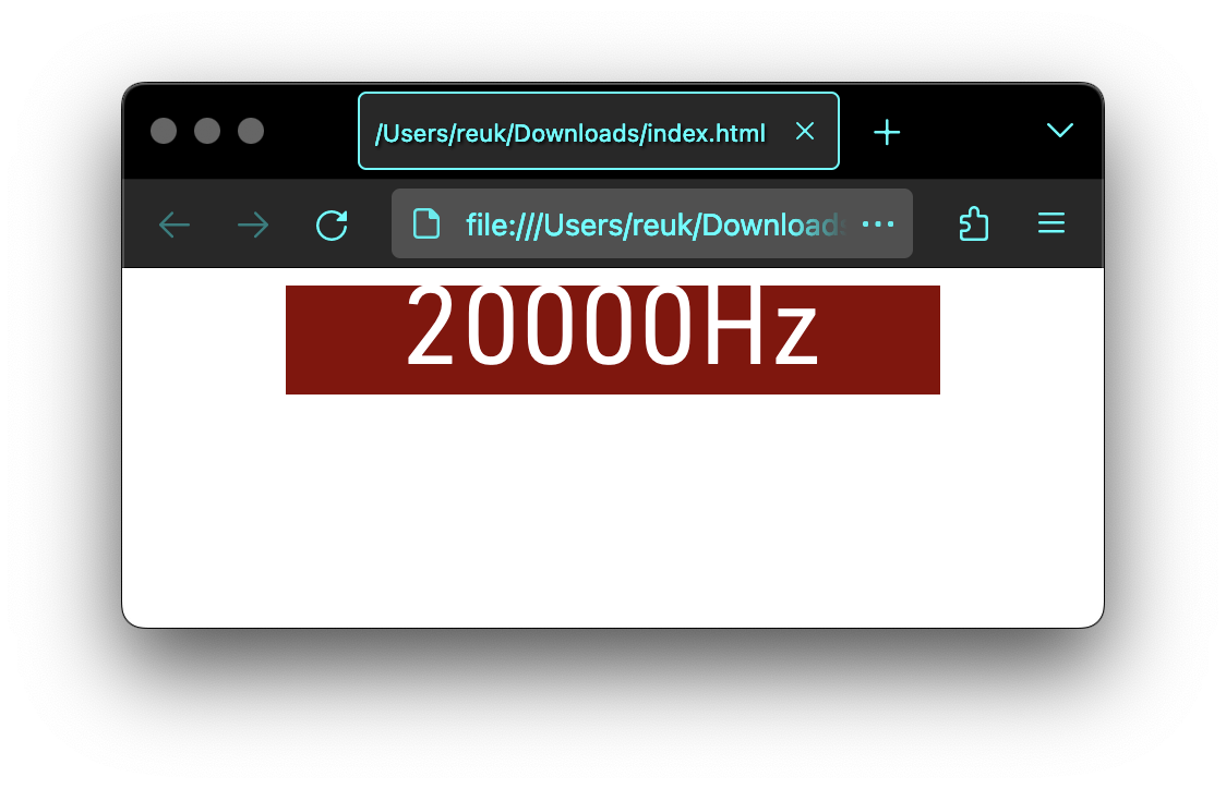
Finally, we can show that this issue is not specific to JUCE by testing out the font in a browser. This snippet vertically centres some text in the DIN font inside a fixed-size rect.

<!DOCTYPE html>
<html>
    <style>
@font-face {
    font-family: "DIN";
    src: url("/path/to/DIN.ttf");
}
.center {
    display: flex;
    margin: auto;
    width: 300px;
    height: 50px;
    font-size: 50px;
    background: darkred;
    color: white;
    justify-content: center;
    align-items: center;
    font-family: "DIN";
}
    </style>
    <body>
        <p class="center">20000Hz</p>
    </body>
</html>

You can try changing the font-family line to see how other fonts look. Helvetica, Arial, and Verdana all look better to me, but none of them are ‘perfect’.

I suspect that the FreeType wrapper you were using may have been selecting Win metrics rather than Typo metrics, though I haven’t attempted to verify this.


Unfortunately, I’m not sure where to go from here. In the short term, perhaps the font(s) can be patched to replace the typo metrics values with the win metrics values. This seems like it would be a fairly straightforward change, but I don’t know whether it might have other repercussions, e.g. for baseline positioning.

A bigger change would be to add some kind of metrics override in JUCE when loading a font from a data block, to specify which kind of metrics should be preferred. Perhaps this could be enabled via new members in the TypefaceMetricsKind enum. A different approach would be to support something like the CSS ascent-override and descent-override directly in Font.

I’d prefer to avoid making changes in JUCE until we have a few reports of similar issues/fonts, so that we can be sure we’re adding a feature that addresses the requirements of all users.

As a reference here is TheVinn code we use
vf_FreeTypeFaces.cpp (25.0 KB)

I think there’s a couple of different issues here.

Firstly, JUCE still doesn’t currently have an API for working with font collections. Typeface::createSystemTypefaceFor expects the provided data block to contain a single face. If you pass a font collection like SF-Pro.ttf, you’ll just get the default style. If you want to load multiple styles from memory, then you currently need to call createSystemTypefaceFor multiple times, once for each style (SF-Pro-Display-Regular.otf, and SF-Pro-Display-LightItalic.otf). You haven’t shown how you’re creating your Typeface, but I assume you’re loading a .ttf that contains many faces.

Secondly, the relationship between Typeface and Font in JUCE is a bit complicated.

A Typeface is always required in order to draw some text. A Typeface instance has a locked-in family and style, which cannot change over the lifetime of the Typeface. A Typeface is also size-agnostic, and isn’t aware of extended styling information such as underlines, horizontal scaling, and tracking.

Font instances do hold extended styling information. A Font may also hold a shared pointer to a Typeface that has been resolved for that Font. This typeface resolution can happen in a couple of ways:

  • When Font::getTypefacePtr() is called, if the font hasn’t already resolved a Typeface, then the system will be searched for a suitable face based on the current family name and style strings set on the Font. This typeface will be cached internally by the Font until it is invalidated, e.g. because the Font’s family name or style were changed.
  • A Font can also be constructed directly from a Typeface. In this case, the font’s name and style will be set to match the typeface’s name and style, and the provided typeface will be cached internally, bypassing the system-lookup above.

In the example you posted, the use of an explicit Typeface is taking precedence over the style/name options. That is, you’re passing a Typeface which already has the ‘Regular’ style set, so trying to modify its style has no effect. As I mentioned above, you probably meant to load each style from a separate memory block. If you do this, there’s no need to call withStyle or setStyle yourself, because the style is set when creating the Typeface.

It seems the FontOptions API still has some rough edges, so I’ll try to find whether there’s anything we can do to make this more difficult to misuse.

I’ve checked this

and
https://wiki.inkscape.org/wiki/Text_Rendering_Notes#Font_Metrics
and
https://www.w3.org/TR/CSS2/visudet.html#sTypoAscender

and it looks like you should probably more use os/2 ascent unless Use Typo Metrics is set.

← doesn’t look like chrome do this though according to your test

As per your links

It is recommended that implementations that use OpenType or TrueType fonts use the metrics “sTypoAscender” and “sTypoDescender” from the font’s OS/2 table for A and D (after scaling to the current element’s font size). In the absence of these metrics, the “Ascent” and “Descent” metrics from the HHEA table should be used.

CSS dictates that one should use the OS/2 sTypoAscender and sTypeDescender values if available, falling back to the HHEA Ascent and Descent values if missing

If you can safely ignore older (i.e., pre-2006) MS Office versions, you should add a Use Typo Metrics parameter to File > Font Info > Font. If checked, applications that respect this setting (in particular, versions of Microsoft Office since 2006) will prefer typoAscender, typoDescender, and typoLineGap over winAscent and winDescent for determining the vertical positioning.

In general it is my understanding that nothing other than some rare applications that need legacy support for opening older documents should ever read the win ascent / descent values (an example is MS-Office so it can open old documents and theoretically render/print them exactly as they were originally created). The “use typo metrics” is a hint to those rare applications that would otherwise read those values that they don’t need to and instead they can load the typo metrics.

On the other hand fonts still set the win ascent / descent values so that any application that does use them doesn’t clip the font rendering. As I understand it some characters may extend beyond the typo / hhea ascent / descent values, and older applications that use the win ascent / descent values are likely to clip the font rendering beyond that point. Therefore font designers try to accommodate for this by increasing those values to include the ascent and descent of all (or at least the majority of) possible characters.

In “TheVinn” code shared above prepareFace() looks very suspicious

  virtual void prepareFace ()
  {
    // calculate outline scale factor
    float scale = 1.f;
    // convert from font units to Juce normalized
    scale *= 1.f/m_face->units_per_EM;
    // fudge since Juce produces smaller paths than FreeType
    // when it uses the Win32 API to extract the curves (?)
    float boxHeight = float(m_face->bbox.yMax - m_face->bbox.yMin);
    float fudge = m_face->units_per_EM / boxHeight;
    // this small adjustment produces output identical to Juce under win32
    fudge *= 1.0059625f;

    setParameters (scale * fudge,
                   FT_LOAD_NO_BITMAP | FT_LOAD_NO_SCALE,
                   fudge/ float(m_face->ascender - m_face->descender),
                   FT_KERNING_UNSCALED);
  }

At a guess I wonder if this was only tested with a few fonts because I’m doubtful a fixed “fudge” value would work for all cases.

Unfortunately in JUCE 7 and below on Windows the ascent and decent values were read from the win ascent / decent values (this was just because of the windows API being used). If I’ve understood correctly it seems this code it’s trying to treat the Windows values as the gold standard and make this code consistently match that on all platforms? Unfortunately that was probably the wrong way to approach it.

So the correct behaviour for JUCE should be

  • Use typo metrics where possible
  • Otherwise use HHEA metrics
  • NEVER use win metrics (although maybe there is an argument for an application to request these metrics)

The behaviour of all previous versions of JUCE was (as far as I can recall)

  • On macOS / iOS use HHEA metrics
  • On Windows use win metrics
  • On Linux (and Android?) - I might have this wrong but this is how I remember it
    • If “Use typo” flag enabled, use Typo metrics
    • If “Use typo” flag disabled, use HHEA metrics

Fair enough. I can try to fix manually those font

I’d vote for such a feature.
When developing plugins we tend to use weird fonts (eg because it matches the esthetic of some given hardware), much more so than in web development.

+1

Just wondering, is there a font editor on OSX that allows me to edit the value of the font ?

Thanks !

FontForge FontForge Open Source Font Editor

1 Like
  • Download FontForge
  • Open the font
  • In the menu goto “Element >> Font Info”
  • On the left hand panel select “OS/2”
  • Select the “Metrics” tab
  • Edit the values
  • “Ctrl + s” to save

Okay. Setting aside the “what you probably meant to do” line, because if I had meant to do that, I would have, let me clarify:

There is no scenario where I’m not shipping a font with a product. So system typefaces have no interest to me. You actually answered without making it look like it’s a bug, by saying it will load the default style from a multi-style typeface pointer.

But since getAvailableStyles() results in an array containing all styles in the multi-style typeface, one or the other is a bug. It should only return the default, since the other 44 are not available (and thus at odds with the concept of acquiring the status of availability), or all 45 should be available to assign withStyle().

Either getAvailableStyles() has a bug, and needs to be fixed, or (my preference) withStyle has a bug and needs to be fixed, since it won’t set style on multi-style typefaces. Of which there are not a few.

(Since it looks like I am complaining, when I read that back, the new font system is fantastic. Really well done; it is so much easier to deal with multiple styles now with FontOptions, it’s not even funny. But this one little bit would put it over the top in to magical.)

3 Likes

Sorry for my poor choice of words. I was trying to provide a different way of producing the effect that it sounded like you wanted, in case the issue was a blocker.

I see where you’re coming from. Although it’s a bit confusing, it’s not clear to me that there’s a bug here. Font::getAvailableStyles() returns the styles that are available (including system-installed fonts) for the Font’s current family name. If you were to create a font using name+style strings, without specifying a Typeface::Ptr, then I expect this would work, though it might select a font installed on the system.

The issue arises because initialising a Font using an explicit Typeface::Ptr forces it to use the name and style defined for that Typeface. A JUCE Typeface can only have a single style.

If we were to make changes in this area, I expect we’d do something like adding a static int getNumTypefaces (const void*, size_t) API to find the number of typefaces that are available in a particular block of typeface collection data. Then, we’d add an extra int index argument to static Ptr createSystemTypefaceFor (const void*, size_t, int index) to make it possible to load every typeface from a typeface collection.


On the newest JUCE 8 branch I’ve tweaked FontOptions a bit. There are some new assertions that warn when the API is used in a way that may produce unexpected results. Hopefully this should make the behaviour more intuitive.

Some info for people using TheVinn FreeType code.
You can batch your font using fontforge and its python binding, so you can use the biggest bounding box for the typo and hhea infos.

There is still some issue with some fonts, but I didn’t find the reason why yet.

import fontforge
from pathlib import Path

paths = list(Path("fonts").rglob("*.ttf"))

# Constants
for path in paths:
    file = str(path.resolve())

    font = fontforge.open(file)

    yMin = 0
    yMax = 0
    for glyph in font.glyphs():
        yMin = min(yMin, glyph.boundingBox()[1])
        yMax = max(yMax, glyph.boundingBox()[3])

    # OS/2 -> Metrics
    font.os2_typoascent = round(yMax/1.0059625) # 1.0059625 from the Vinn code
    font.os2_typoascent_add = False
    font.os2_typodescent = round(yMin)
    font.os2_typodescent_add = False

    font.hhea_ascent = round(yMax/1.0059625)
    font.hhea_ascent_add = False
    font.hhea_descent = round(yMin)
    font.hhea_descent_add = False

    output = Path(file).parent / Path("../fontsedit/") / Path(file).name
    output.parent.mkdir(parents=True, exist_ok=True)
    font.generate(str(output.resolve()))
    font.close()```