Juce FFT Real and Imaginary FFT Tutorial Question

The JUCE documentation say performRealOnlyForwardTransform() does the following:

“On return, if dontCalculateNegativeFrequencies is false, the array will contain size complex real + imaginary parts data interleaved.”

However, in the “Visualise the frequencies of a signal in real time” tutorial (https://docs.juce.com/master/tutorial_spectrum_analyser.html), I do not see them getting the magnitude of each bin by using Pythagorean theorem.

This is what they do:

        window.multiplyWithWindowingTable (fftData, fftSize);       // [1]

        // then render our FFT data..
        forwardFFT.performFrequencyOnlyForwardTransform (fftData);  // [2]

        auto mindB = -100.0f;
        auto maxdB =    0.0f;

        for (int i = 0; i < scopeSize; ++i)                         // [3]
        {
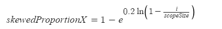
            auto skewedProportionX = 1.0f - std::exp (std::log (1.0f - (float) i / (float) scopeSize) * 0.2f);
            auto fftDataIndex = juce::jlimit (0, fftSize / 2, (int) (skewedProportionX * (float) fftSize * 0.5f));
            auto level = juce::jmap (juce::jlimit (mindB, maxdB, juce::Decibels::gainToDecibels (fftData[fftDataIndex])
                                                               - juce::Decibels::gainToDecibels ((float) fftSize)),
                                     mindB, maxdB, 0.0f, 1.0f);

            scopeData[i] = level;                                   // [4]
        }

I suspect the magnitudes are extracted here somehow because scopeData has a size of 512 where fftData has a size of 2048, but I am confused about the math. Does anyone know how this math is getting the magnitudes of the FFT bins? Also, could anyone explain the math behind getting skewedProportionX?

The tutorial uses performFrequencyOnlyForwardTransform, not performRealOnlyForwardTransform.

The documentation says about performFrequencyOnlyForwardTransform :

1 Like

AH! So similar, but so different!

Can you explain the math behind skewedProportionX?

It’s just a way to access the FFT result data so that it looks nicer on the screen. If no scaling for the data access was done, most of the screen space would show high frequencies. When implementing analyzers, it would be best to allow optional frequency scaling settings for the users, but in that tutorial they have chosen to use only this particular non-linear scaling. (I didn’t calculate how it works exactly, but I make a guess the mapping is done so that 1000 Hz is somewhere in the middle of the graph.)

I understand it scales the frequency axis so that it isn’t linear. I am trying to understand the reasoning behind the following math function:

image

I am trying to figure out the math behind it so I can put frequency markings on the x-axis that corresponds to the correct frequencies of the FFT.

It’s a math problem, sure. I can take a look at it at some point, or maybe someone else will be able to answer you sooner than I can.

it just makes it logarithmically. if you’ve ever seen the difference between a linear and a log spectogram you’d know that it just looks much more reasonable in regards to the human perception. it’s basically the same like using db instead of pure amplitude in terms of volume. just looks more complicated.

look at the curve with a size of 1 to see how it skews https://www.desmos.com/calculator/962slwxtnv