The text display using JUCE library is not as good as Native font painting.
Anyone in the forum used an alternative (Infact it may be even there in JUCE which Iam not aware of)
Rgs
srikanth
The text display using JUCE library is not as good as Native font painting.
Anyone in the forum used an alternative (Infact it may be even there in JUCE which Iam not aware of)
Rgs
srikanth
I also have the same problem.
may be JUCE’s font inherently fuzzy.
this is also a style. However, I don’t like this style of JUCE.
I hate to bring this up again, but can you tell me where in the juce code anti-aliasing is actually drawn.
I need to disable it for small font sizes. I am sorry but the anti-aliasing is just not good at small font sizes.
Both mac and windows allow you to disable it for smal fonts.
I'm interested on this topic as well. Some fonts draw beautifully without anti-aliasing, and I'd like to have this possibility in JUCE as well. Yes, it will be my own resposibility to choose the proper fonts, and I'll burn in hell if I release an app with the wrong font or font size, but please expose an option to disable font anti-aliasing.
Thank you very much!
Seriously guys, it's nearly 2016.
People have high-res monitors nowadays.
If anyone at either ROLI or Tracktion even suggested using fonts so small that the anti-aliasing became relevant, they'd be laughed out of the room. The reaction of other developers would a face-palm, and our graphic designers and UX people would howl in pain at the idea.
Creating tiny, crowded interfaces is just not something that self-respecting developers do any more. Read any guide on good UX/GUI design and it's all about making things big, clear, minimal and responsive.
I have seen this topic come up so many times on this forum that I think it should be a sticky :)
Either it appears like in this thread, or it is a discussion about the AA being ugly.
Which it arguably used to be on some platforms, but I think it now has been fixed...
@Jules: Following that logic, there would be SO many things in JUCE that should be removed because "is just not something that self-respecting developers do any more". My opinion is highly subjective anyways, just as yours. For example, I hate round buttons and I would laugh out of my room anyone who suggest using round buttons in any serious UX/GUI.
Aliased fonts is a simple feature request that makes perfect sense to a part of your CUSTOMERS / users / community in some of their specific projects.
It may be a problem of the display screen (low-res screens in low-end smartphones or tiny displays in embedded Linux devices will be still supported in 2016, right?). Or it may be just an aesthetic consideration. Personally, I always use aliased fonts in my Full HD+ displays just because I feel them more confortable to read every day than smoothed fonts. It's my personal preference that makes perfect sense, just as yours.
I'm aware that JUCE stands for "Jules' Utility Class Extensions". But if you aim to sell your product and keep your community of users and customers happy, you should listen at them and attend their requests, even those you don't fully agree with, provided these features don't make a big deal to implement or maintain. Above all, you shouldn't disparage them just because you don't fully agree with their requests, no matter how valid you think your arguments are.
Seriously, it's nearly 2016 and nobody considered serious would have a forum like this one, where several features are broken (code) or don't exist (Link button?). BBcode, HTML, Insert Table? Are you from the past? Even the browser's spellcheck and the right-click menu are taken over (are we still in the 2000's?). Or nobody would have an online API reference without a Search function. We could play that game in many aspects, but nobody would win.
I don't really think that a method Font.SetAntialiasEnabled(bool enabled) would be too work for you, and you would make a lot of your users / customers / community happy.
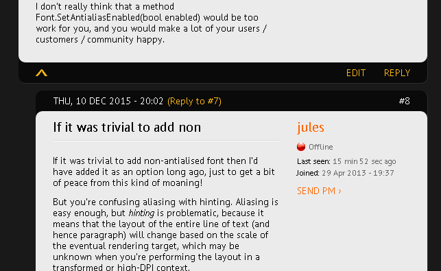
If it was trivial to add non-antialised font then I'd have added it as an option long ago, just to get a bit of peace from this kind of moaning!
But you're confusing aliasing with hinting. Aliasing is easy enough, but hinting is problematic, because it means that the layout of the entire line of text (and hence paragraph) will change based on the scale of the eventual rendering target, which may be unknown when you're performing the layout in a transformed or high-DPI context.
Because this causes horrible problems when zooming a GUI smoothly (and because most graphics experts also hate hinted fonts), it's a technique that is rapidly dropping out of favour not just with me, but with all the OS makers: Apple, Microsoft, Google - everyone in the industry is moving away from aliasing/hinting and towards vector-based, orientation-agnostic text layout.
If you genuinely still use aliased fonts, enjoy them while you can! Before long everything you see on all devices/OSes will be getting rendered by the GPU, using size-independent algorithms like Loop-Blinn to draw glyph outlines in the same way as any other path is treated.
You seem pretty irate about my criticism of your post, and I'm sorry, that wasn't the intention - I meant it in a light-hearted tone. But I'm not going to apologise for criticising an ugly and out-dated technique which only existed as a workaround for technical constraints in the 1980/90s, and which the entire industry is trying hard to move on from.
@Jules, thank you for your reply, especially on pointing out the difference among anti-aliasing and hinting.
Just to get things definitely clear on this issue now and in the future, I wonder if/how fonts like these could be achieved in JUCE:
The above is Visual Studio 2015. The fonts seem specifically designed not to require anti-alias and they keep crisp-clear lines at small sizes.
This is how the JUCE forum displays in my browser (Vivaldi):
Some time ago (2-3 years) the widely used development tool Unity 3D introduced anti-aliased fonts in the editor. It was so much difference and people complained so much that Unity devs had to make it optional. They understood that the anti-aliased fonts were so much blurred that they caused noticeable eye strain to developers using it daily.
Could we have those results in JUCE just by disabling anti-alias? Maybe using specific fonts at specific pixel sizes? Maybe having a method for calculating the font size that fits a specific target display keeping crisp-clear aliased lines? Come on, we still can specify pixels on window and component sizes :)
Or is font hinting in effect at the above screenshots, so the result would be wrong anyways?
Still, I'd suggest to have an option to disable anti-alias (the easy part). Or give us a hint for modifying the JUCE code ourselves and experiment with aliased fonts. When you need to put a lot of information on the screen, as typical development tools do, you forcefully need to use small fonts, no matter how well designed is your GUI. Then the font anti-aliasing easily becomes a problem.
You Apple fans are used to smooth fonts, and it's great on Apple devices, zooming in and out everywhere (I also own a MacBook Pro). But it's not so great in Windows, where the quality of the font smoothing greatly depends on actual display model / drivers / windows settings, RBG order in pixels, techinques, fonts, etc. In many cases results are bad, despite whatever Microsoft says, and people standing 24/7 in front of the screen like me (well, almost :P) really notice it.
Jules, you're being too optimistic here.
Go to a computer shop and look at how much laptops still have the dreaded 1366×768 resolution. Higher resolutions are finally more common now, but just 3 years ago 15-inch laptops almost universally had this low resolution. And not everybody buys a new laptop every year, so you should assume a lot of these are still in use.
And what about Apple? Imacs only got retina displays a bit more than a year ago, and the standard resolution version is still in the Apple store today. The relatively low-resolution Macbook Air, and the thunderbold display are still around as well.
For the near future we will still have to worry about these things like pixel-aligning our graphics, and making sure fonts are properly hinted. And those graphic designers and UX people will still have to howl in pain for a while.
--
Roeland
… and smaller fonts look terrible in Parallels if running Windows on a Mac VM.
Rail
Hinting is a difficult problem.
If you have one of these advanced photo editors (like GIMP or Photoshop) you can enter some text and disable both hinting and anti-aliasing:
(that's scaled 200%)

Linux desktops used to have a terrible reputation in this regard, a lot of programs would show fonts as in the above image unless you spent a lot of time tweaking various settings / files etc.
Not that I particularly like agressive hinting. How many webfonts have you seen which look like crap on Windows?
The font-layout can indeed change when you zoom in or out. GUIs usually don't zoom, but if I zoom out this page in my browser, I can see the text wrapping change between zoom levels, even though the posts are rendered with the same logical width.
--
Roeland
Achieving this look with arbitrary fonts is an incredibly difficult problem. Most likely the fonts in those screenshots are indeed very carefully hinted. They may even have separate hinting instructions for different font sizes
“Could we have those results in JUCE just by disabling anti-alias?” → that answer is no, not at all, it will likely look like the image I posted above.
--
Roeland
Not all fonts are properly displayed without hinting nor anti-aliasing. Your picture shows one of many possible examples.
I'm pointing out that some specific fonts at some specific pixel size are nicely displayed without any anti-aliasing (I don't know if they're using hinting). Check out my other post in the second page of this thread for some examples on nice aliased fonts on actual software.
What we're claiming is having the choice to disable anti-aliasing at our own responsibility of choosing the proper font at the proper pixel size. That's all!
I'm not claiming to use arbitrary fonts! That would be not difficult, but impossible in my opinion.
I'm aware that only a small subset of fonts is suitable to be displayed that way. For example, Lucida Console (used for the source code in the VS2015 picture) looks nice without any smoothing.
What we're claiming is having the choice to disable anti-aliasing at our own responsibility of choosing the proper font at the proper pixel size, if that makes possible to have those results. That's all!
@Jules "People have high-res monitors nowadays" is very very subjective, to say the least.
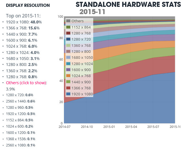
Let me throw in some objective data. Unity 3D has a public page with hardware stats coming from people using the own Unity 3D development tool and the games and applications deployed with Unity 3D. The stats are updated monthy:
http://hwstats.unity3d.com/
Let's check out what the stats say about the display resolution.
Editor
These are people using Unity 3D for authoring applications, that is, developers:
http://hwstats.unity3d.com/editor/display.html
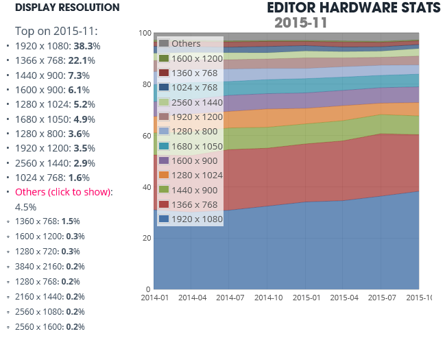
Surprisingly, only around 3.5% of developers use a resolution larger than Full-HD. Most surprisingly, the most used resolution on OSX is 1440x900 (24.9%), followed by Full-HD (24%) (you can select All / Windows / OSX on the stats page).
Standalone
These are people using applications or playing games developed with Unity 3D on non-mobile platforms.
http://hwstats.unity3d.com/pc/display.html
Only 0.7% of people has a display with resolution larger than Full-HD 1920. What is worse, the tendency shows no sign of this going to change anytime soon, other than people slowly upgrading to Full-HD.
It's a bit better at the OSX stats, where 6.4% of people has a display larger than 1920. But still, on OSX the 63% of displays are 1280x800 and 1440x900.
Mobile
People playing games developed with Unity 3D on their mobile devices.
http://hwstats.unity3d.com/mobile/display.html
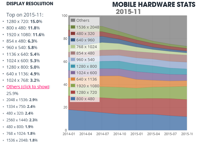
Here, Full-HD and larger resolutions are around 20% of devices only. Most used resolutions are 1280x720 and 800x480, with many resolutions smaller than 1K having a significant quota.
So... Looks like that small display resolutions is something we will have to live with in the coming years if we want our products to be competitive, no matter we like it or not. Assuming "everyone has high-res monitors" is simply a bad business strategy at this time.
There is a need for designing interfaces where, in some cases (i.e: development tools) a lot of information must be in the screen, and thus small fonts must be used. But in JUCE, small fonts display very very bad with the anti-alias. This is a problem, in my opinion.
Oh, come on! Those numbers obvously don't take into account the DPI..
The reason 1440x900 keeps turning up as the most common resolution is because that's how a Retina MacBook reports its resolution when you use the default scale factor. Resolution is no longer the same as the pixel count!
Sure, I can easily believe that only 3% of people use a super-high-res display at a 1:1 scale factor, because that's kind of silly unless it's physically enormous, but a large (and most importantly rising) proportion have higher DPIs now.
Hi Edy,
I can understand your grief. It's frustrating if JUCE features that you'd like to work in a certain way for your app are not there. Please believe me that listening to our community and our users and making them happy is really important to us. This is the reason why we hang out in this forum every day, try to reply to everything that comes up, and fix problems that seem relevant as quickly as we can.
The font aliasing and hinting topics are quite complicated technically, as Jules and roeland already pointed out. Even doing a subset of what is discussed here, e.g. just disable anti-aliasing, even if not complicated conceptually, is a very low-level change that would ripple through our whole codebase and could potentially cause all kinds of problems and a lot of effort. Also, it may not even be possible on some platforms (what about Android for example? Don't know!).
Basically this is a choice whether we want to spend a lot of time to build and maintain a feature that will become less and less relevant in the next couple of years, until it eventually dies out completely -- or whether we should spend our time instead on features that actually offer new and useful functionality and exciting new technology.
So I hope you can understand where the decision not to do it comes from.
By the way, although it's off-topic: The things you mentioned earlier in this thread about the website and the forum: I couldn't agree more. There are many things that could be improved on the website. Afaik some things like the Seach function broke in one of the updates during the last few monts related to the new branding. Unfortunately we in the JUCE team here are not web developers. We can't just go ahead and magically write a new web forum ourselves. These things need to be done by people who actually know what they are doing, and since so many things happen at ROLI at the moment, it's quite hard to get some of their time! Please trust us that we are just as annoyed about these website-related shortcomings as you are, and are doing everything in our power to improve things for you folks as soon as possible.
Thank you very much for your detailed reply. Definitely understood.
Yes, I felt a bit frustrated because I see that I can put crisp-clear aliased text using other development tools (i.e. Unity 3D, where it works perfectly also on Android) but I can't do that using JUCE. In my opinion this won't change so much in the coming years, and there will always be specific projects with a legitimate need for this feature. Anyways, I understand your point and won't raise it again.
Finally, I'd only suggest you to consider including a third-party font rendering engine for these cases, such as Freetype (http://www.freetype.org/). Maybe as a new JUCE module?
I thought Jules was going to add FreeType at one point…
Rail