Sorry for jumping in late. Here’s my 2 cents.
To my knowledge most ‘beautiful GUIS’ are made with Photoshop. Particularly you’d need to master:
[list]
[] Most of the graphics is generated using layer effects. You’d need to know them all and their internals (the z-order of their rendering, and which FX wins over which). In fact, you’ll need a phenomenal understanding of these as you will have to know this feature of Photoshop better than 95% of professional graphic designers. The hurdle with effects is that once you learned them by manual, you’d need to study how they are used, for which you need to inspect PSD of various artists (some are free, some for a fee); for example, I’ve learned loads from this guy.[/]
[] Understanding of paths and more importantly vector masks (you’d need this in order to scale your graphics without pixelation, even if you scale by 5 pixels).[/]
[] Opacity and Blending modes are also very importent (and beat me to it, I know what each stands for, but no idea what will happen as I toggle between from one to another, so toggle I am).[/]
[] Rulers and Guides (for layouts). [/]
[] Then you sometimes use brushes.[/]
[] Although not exactly a photoshop feature, you’d need a good understanding of lights and shadows.[/][/list]
I’d start by googling ‘Photoshop UI design’ for a wealth of tutorials (you’ll find things like this one). After you’ve done a dozen tutorials or so, have a look at (my favourite) uiparade.com, you’ll be able to look at designs and understand how they’ve been achieved. Another thing you can do is take photos of desks and rack units and re-create the controls with a photoshop composition.
Then come some basic concepts in graphic design:
[list]
[] Layout. Have a look at the DigiRack EQ - it’s very well laid out, compared to the ugly Logic EQ; and here’s a plugin with no sections and many controls, which would make your eye search whenever you want to tweak something.[/]
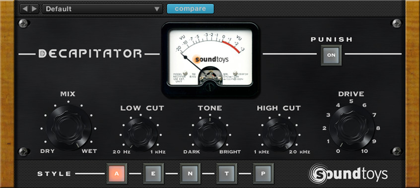
[] Contrast - a not so great example would be Soundtoys’ Decapitator - the black knobs fuse with the black background = low contrast; also note the blurry white highlights on the top of the meter - the best designs I’ve seen are sharp.[/]
[] Typography - yes, some fonts are better than others.[/]
[] Colours and Tones[/][/list]
There’s many more, but these are the core ones for GUI. I’m not even getting into usability etc. since you’ve asked about beauty.
A lot of this stuff is about attention to details. If you look at Waves plugins from the last 15 years, they progressed from no attention to details, to attention to details, to hyper attention to details.
Then finally comes the question of what to export and how. For example, if you have 3 buttons, do you export on/off state for all (6 images), or do you export 1 on state, 1 off state, and 3 different labels? Do you export 60 different positions of a rotary pot, or ‘cheat’ with base that has a small round handle which is the only thing that moves?
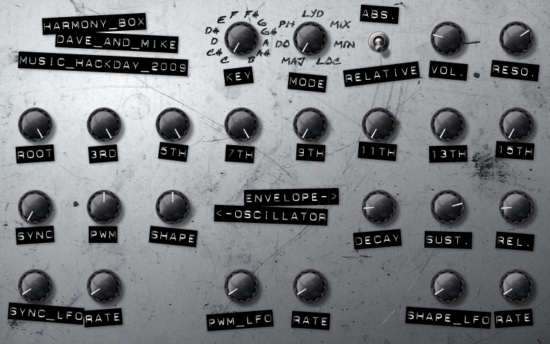
Allow me to give you an example. The following design took 10 layout drafts, 26 button drafts and approximately 60 hours to make in photoshop (from scratch):

Other than the left/right glows on each buttons and scratch marks, everything in this is vectors and effects.
In this, for example, just how the knob base blends to the surface took an hour of experiments.
The base surface is composed of a pattern texture; on which there’s a (‘white to black’) gradient, on which there is low opacity ‘scratches’ layer (using a brush). Then on top of everything there’s light-complexity layer (to gel the controls and textures to the surface and add some shade complexity).
Each button is made using this composition (on average, you tweak around 3 parameters on each effect):

As for export, the base is exported with all buttons off, but no labels; each label is exported with alpha (ie, no button underneath); then the lit image is not transparent over the button but with alpha on the outer blur, which has to be rendered without the button shadow so when you put it on top you don’t get a bolder shadow; and then the lit label has to bit exported a well (not straightforward - you need to understand blending modes to do this right). The whole thing is 7 PNGs (omitted is the handle of the knob).
Perhaps I’ve went well beyond your interest, but this was just to show that this is complex stuff, yet can be learnt by anyone. If time is not an issue, I don’t see why anyone would fail to do the same thing in 200 odd hours or so, not knowing Photoshop at the onset.

 I’m sure they’ll like yours - very, very nice!